Most salon owners I talk to think their salon website UX is fine because it "looks pretty." Then I ask them how many bookings came through it last month, and the room gets quiet. A pretty site is not the same as a site that books appointments at 9pm on a Tuesday when your phone is off.
Salons live and die by their calendar. If a client cannot book in under a minute on her phone while waiting in line at the coffee shop, she will call a competitor. That is the bar now. So let’s get into nine specific changes I keep seeing pay off for salons, spas, and barbershops that take their website seriously.
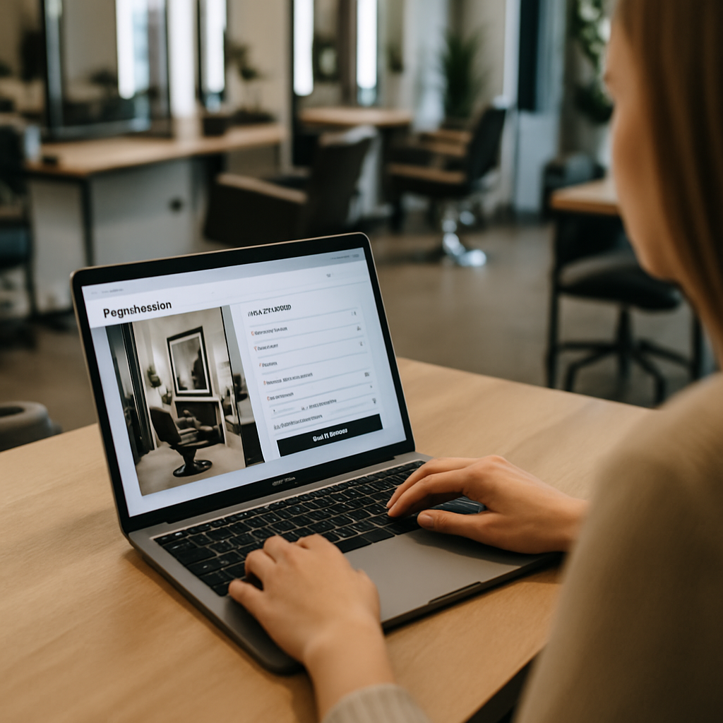
1. Put The Book Now Button Where Thumbs Live
The single biggest salon website UX mistake is hiding the booking button in a top menu. On mobile, the thumb sits at the bottom of the screen. That is where your primary CTA needs to be.
Use a sticky bottom bar with "Book Now" that follows the user as they scroll. Make it a color that does not appear anywhere else on the page. I have seen salons double their mobile conversion just by moving that button six inches down the screen.
Also kill the "Call Us" link as the primary action during business hours. Calls interrupt stylists mid-service. Online booking does not.
2. Show Real Prices Before The Booking Flow
Hiding prices feels protective. It is actually the fastest way to lose a first-time client. People are anxious about salon pricing, especially for color and extensions, and they will bounce if they have to chase a number.
Put a clear service menu on the homepage with starting prices. "Balayage from $185" is enough. If pricing depends on hair length, say that out loud. Honesty in your salon website UX builds the same trust as a friendly receptionist on the phone.
This is the same principle behind good SaaS dashboard design. Show people what they need to decide, no clicks required.
3. Use Real Photos Of Your Actual Work
Stock photos of glossy models will not help you. Phones are good now. Buyers can smell a stock image at fifty paces, and it makes them wonder what else is fake.
Post before and after shots from your actual chair. Tag them with the service name and the stylist who did the work. A small "Booked with Maya" caption is doing three jobs at once: social proof, stylist promotion, and a soft nudge toward the booking page.
Galleries should load fast. Compress everything. A salon website UX that takes nine seconds to load on 4G is a salon website that loses Friday night browsers.
4. Let Clients Pick A Specific Stylist
This is non-negotiable in 2026. Clients have a stylist. They are loyal to her, not to your brand. If your booking flow does not let them pick a name first, then a service, then a time, you are fighting your customers.
Show each stylist’s photo, specialties, and next available slot right on the team page. Add a small "Book with Jess" button under each profile. The booking system should remember her preferred stylist for the next visit too.
5. Cut The Booking Form Down To Three Fields
Every extra form field costs you bookings. I mean that literally. Industry data on form length is brutal, and salons keep asking for emergency contacts and birthdays at the booking stage.
You need three things to confirm an appointment: name, phone number, and the service slot. Email is nice but optional. Everything else can wait until the client is in your chair sipping a cucumber water. Strong salon website UX means asking for the minimum and getting out of the way.
If you want to send birthday promos later, capture that field in a post-visit email. That feels generous instead of nosy.
6. Make Cancellations And Rescheduling Painless
This sounds counterintuitive. Why make it easy to cancel? Because clients who cannot cancel online just no-show. And a no-show is far worse than a reschedule.
Send the confirmation email with a one-click reschedule link. Same for SMS. A polite cancellation policy ("Please give us 24 hours") sits right next to the link, and most people respect it when the path is clear.
Your salon website UX should treat the calendar as a living thing, not a trap. The same principle I wrote about for mobile app onboarding applies here: friction kills good habits.
7. Lead With Reviews That Sound Human
A wall of five-star reviews looks generic. One detailed review that mentions "Carla fixed my brassy highlights and explained why my old toner was wrong" does more work than fifty thumbs-up.
Pull two or three specific reviews onto the homepage with the reviewer’s first name and the service. Link to your full Google profile. Google’s own research on local search behavior confirms that recent, specific reviews drive booking decisions far more than star averages.
If a client wrote something amazing, ask if you can use her photo too. Most say yes. That tiny detail makes the testimonial unskippable.
8. Build A Mobile-First Salon Website UX From The Ground Up
Over 70% of salon traffic is mobile. So why do so many salon sites get designed on a 27-inch monitor first? Start with the phone view and let the desktop version be the bonus.
That means giant tap targets, no hover-dependent menus, and forms that work with autofill. Test the site on an actual phone in actual sunlight. If you cannot read the service prices on a bright patio, neither can your client.
A solid salon website UX on mobile also pulls double duty for local search. If you run a neighborhood spot, the same playbook I covered in local SEO for restaurants works for salons too. Google rewards fast, mobile-friendly local sites with map pack visibility.
9. Add Smart Reminders And A Loyalty Loop
The booking is not the end of the salon website UX journey. It is the start of the next one. A booking confirmation should include the date, the stylist’s name, a parking note, and a one-tap "Add to Calendar" button.
Two days before the visit, send a friendly SMS reminder with the reschedule link. After the appointment, follow up with a thank-you, a review request, and a soft prompt to rebook in six weeks. Most booking platforms support this. Most salons do not turn it on.
Layer in a simple loyalty perk: ten visits gets a complimentary deep conditioning treatment. Track it on the client’s profile so they see the progress when they log in to book. That tiny progress bar is one of the most addictive elements in any well-designed app or website.
Putting It All Together
You do not have to ship all nine of these at once. Pick the two that hurt the most right now. For most salons I work with, that is the sticky booking button and the stylist-first booking flow. Those two alone usually lift bookings 20 to 40% within a month.
A great salon website UX is not about flashy animations or trendy fonts. It is about respecting how a busy person uses her phone. She wants Carla, Friday at 6, balayage, done. If your site can deliver that in three taps, you win her business. If it cannot, the salon two blocks over will.
Audit your own site this week. Open it on your phone. Try to book yourself for a service you have never had. Time it. Whatever felt slow or confusing, fix that first. Every improvement to your salon website UX compounds, because a booked client today is also a rebooked client in six weeks, and a referral source for the next twelve months.
References
- Think with Google, Local Search Behavior Insights: https://www.thinkwithgoogle.com/consumer-insights/consumer-trends/local-search-statistics/
- Nielsen Norman Group, Mobile Form Usability Research: https://www.nngroup.com/articles/mobile-form-design/
- Baymard Institute, Checkout and Form Field Studies: https://baymard.com/research

