If your store gets traffic but stalls at the final step, your e-commerce checkout UX is probably leaking money. The Baymard Institute pegs the average cart abandonment rate at roughly 70%, and a big chunk of that comes down to friction, surprise costs, and confusing forms. Most of it is fixable.
I’ve watched small Shopify stores claw back six figures a year just by trimming form fields and rewriting button labels. Nothing fancy. Just less stuff in the way. Below are nine checkout wins I keep coming back to, with real examples of what to test and why each one matters.
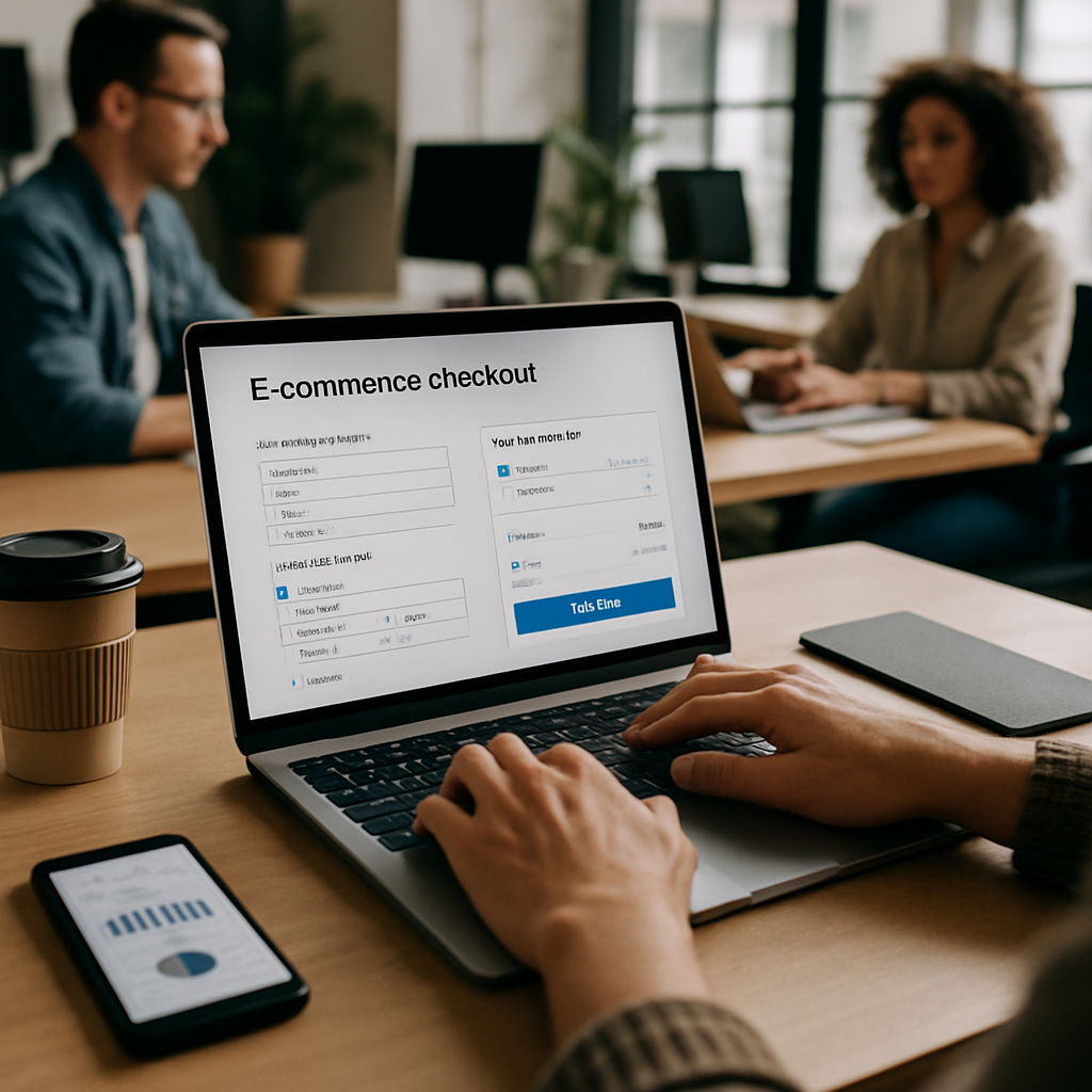
Why E-commerce Checkout UX Decides Whether You Get Paid
Checkout is the part of your funnel where intent is highest and patience is lowest. Someone has already picked a product, pictured themselves owning it, and pulled out a card. Anything you put between them and "Order Complete" is risk.
Good e-commerce checkout UX respects that mood. It hides nothing, asks for nothing extra, and gets out of the way. Bad checkout UX treats the final screen like a marketing opportunity, stuffing in upsells, newsletter signups, and pop-ups. That’s where carts die.
1. Offer Guest Checkout Without Apology
Forcing account creation is the oldest and most damaging mistake in e-commerce checkout UX. Baymard’s research has consistently shown around 24% of users abandon when forced to register. That’s a quarter of your revenue, gone.
Put guest checkout first. Make it the default visual choice. After payment, offer "Save your info for next time?" as a single checkbox. That converts way better than a forced signup wall, and you still get the account when the buyer is happy.
2. Shrink the Form Until It Hurts
Every field you ask for costs conversion. Ask: do you really need a phone number for a digital download? Do you need a company field for a B2C tee shirt? Probably not.
A typical checkout has 14 to 15 form fields. Most stores can get to 8 without breaking anything. Use address autocomplete (Google Places or Loqate) so one keystroke fills five fields. Combine first and last name into one. Skip the "confirm email" field, it doesn’t actually catch typos better than inline validation does.
3. Show Total Cost Early, Including Shipping and Tax
Unexpected costs at the final step are the number one reason people abandon. Not "a reason." The number one reason. If shipping is $12 and tax adds $9, hiding that until step three is just wasting your own ad spend.
Show estimated shipping in the cart based on IP location. Display a running order total that updates with each step. If you offer free shipping above a threshold, surface a progress bar ("Add $14 more for free shipping"). That single nudge lifts AOV reliably.
4. Make Mobile Checkout Actually Work on Mobile
Mobile commerce is over 60% of e-commerce traffic in 2026, but mobile conversion still trails desktop badly. Why? Tiny tap targets, keyboards that cover the field you’re typing in, and zoom-on-focus bugs nobody tested.
Use input types correctly. type="tel" for phone, type="email" for email, numeric inputmode for ZIP and card number. Buttons should be at least 48px tall. Stack fields vertically. Test on a real iPhone SE, not just your dev simulator. The same UX discipline that makes a salon booking app feel effortless applies here: every tap should feel obvious.
5. Offer the Payment Methods Your Customers Actually Use
Apple Pay, Google Pay, Shop Pay, PayPal, Klarna, Afterpay. Each one removes a form. Apple Pay alone can double mobile conversion on stores where it’s properly placed at the top of checkout, not buried.
Buy Now Pay Later is huge for anything over $75. Younger shoppers expect it, and merchants who add it typically see 20 to 30% AOV lifts. Place these wallet buttons above the email field so returning users skip the entire form. That’s a real e-commerce checkout UX win you can ship in an afternoon.
6. Use Real-Time Inline Validation
Nothing kills momentum like submitting a form and bouncing back to a wall of red error messages. Validate as the user types, but be polite about it. Don’t yell "Invalid email" while they’re still on the third character.
Validate on blur (when the user leaves a field), confirm with a green checkmark when it’s good, and explain what’s wrong in plain language. "Please use the format MM/YY" beats "Invalid date." For card numbers, detect the card type from the BIN and show the matching logo. Small touch, big trust signal.
7. Build Trust Right Where the Doubt Happens
People hesitate before clicking the final pay button. Put your trust signals right next to that button, not in the footer. Security badges, accepted card logos, money-back guarantee text, return policy link.
If you sell anything over $200, add a short customer quote near the pay button. "Shipped fast, packaging was great." That’s it. Reviews near the wallet do more than reviews on the product page, because doubt peaks at payment. The same trust-building approach works for service businesses too, like the patterns I covered in law firm website UX, where credibility cues sit close to the conversion ask.
8. Save Carts and Bring People Back
About half the people who abandon will come back if you ask nicely. Capture the email as the first field (before payment), so you can fire an abandoned cart sequence if they bail.
A three-email sequence works well: one hour later (gentle reminder), 24 hours later (address objections, maybe a review), 72 hours later (small incentive). Don’t lead with discounts. You’ll train customers to abandon on purpose. Browser push notifications and SMS recovery both outperform email for younger demos, so layer them.
9. Make Error Recovery Painless
Cards get declined. Addresses fail validation. CVVs get mistyped. When something breaks, your e-commerce checkout UX should make recovery a five-second task, not a restart.
Never wipe filled fields on error. Preserve everything except the field that failed. Show the error inline, scroll the page to it automatically, and pre-focus the cursor in that field. If the card declined, suggest alternates like PayPal or "try a different card" before the user gives up. For high-traffic stores, this kind of fault tolerance is the same thinking behind resilient cloud architecture decisions, assume things will fail and design for graceful recovery.
Putting It Together: A Realistic Rollout
You don’t ship all nine at once. Run a quick audit first. Use Google Analytics 4 funnel exploration to find the single step where the most users drop off, then attack that one.
Most stores I work with see the biggest wins from guest checkout, wallet payments, and honest shipping disclosure. Those three alone can move conversion 15 to 25%. The rest are smaller percentage gains that compound over time.
A practical order I like:
- Week one: turn on guest checkout, add wallet buttons, surface shipping in the cart.
- Week two: cut form fields, add address autocomplete, fix mobile input types.
- Week three: inline validation, error recovery, trust signals near the pay button.
- Ongoing: abandoned cart sequence, A/B test button copy and layout.
Test everything. What works for a fashion brand will not work for a B2B parts catalog. Your customers’ patience, basket size, and device mix all change the math.
Final Thoughts on E-commerce Checkout UX
The best e-commerce checkout UX is the one buyers don’t notice. No friction, no surprises, no second-guessing. You’re not trying to wow them at this stage, you’re trying to get out of their way.
Pick two or three of these wins this month and ship them. Measure before and after. Then pick two more. Compound improvement is how a so-so store turns into a profitable one, and it’s how good teams pull ahead of competitors who keep redesigning their homepage instead of fixing what actually matters.
If you want help auditing your current funnel or rebuilding checkout from scratch, that’s the kind of work our team at KuerySoft does every week. The fastest wins are usually hiding in plain sight.
References
- Baymard Institute, Cart Abandonment Statistics: https://baymard.com/lists/cart-abandonment-rate
- Google Analytics 4 Funnel Exploration: https://support.google.com/analytics/answer/9327974
- Nielsen Norman Group, Checkout Usability Research: https://www.nngroup.com/articles/checkout-process/

