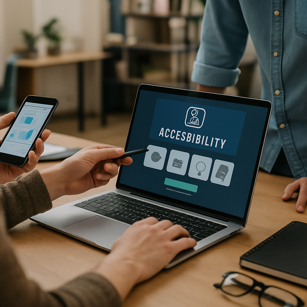
Good accessibility UI design is not a checklist you bolt on the week before launch. It is a series of small, deliberate choices that quietly make your product usable for everyone, including people who navigate with screen readers, voice control, switch devices, or just a tired thumb on a cracked phone screen. I have watched teams ship beautiful apps that locked out 15% of their audience because nobody asked the right questions early.
So let’s talk about what actually works. Not theory. Not vague advice about "empathy." Real patterns that move the needle on usability, conversion, and yes, legal risk.
Why Accessibility UI Design Is a Business Problem, Not a Compliance One
Before the tactics, a quick reality check. Roughly 1 in 4 adults in the US lives with some form of disability, according to the CDC. That is your grandmother with cataracts, your colleague with carpal tunnel, your customer using one hand on a crowded train.
Accessibility UI design treats those people as users, not edge cases. And the side effect is that everything gets better. Better contrast helps in sunlight. Bigger tap targets help everyone. Captions help people in noisy cafes. The accessibility tax pays itself back fast.
Now, the nine wins.
1. Contrast Ratios That Survive Real Lighting
The WCAG minimum is 4.5:1 for body text and 3:1 for large text. Most teams hit it on paper, then ship gray-on-white buttons that vanish outdoors. Push past the minimum. Aim for 7:1 where you can.
Use a tool like the WebAIM Contrast Checker during design reviews, not after. And test your screens on a cheap Android phone outside. You will be horrified, then grateful.
2. Focus States That Are Impossible to Miss
Keyboard users live and die by the focus ring. Yet so many teams remove it because it "ruins the design." That is not design. That is sabotage.
Strong accessibility UI design uses a two-tone focus indicator (a dark inner ring with a light outer ring, or vice versa) so it works on any background. Thickness should be at least 2px. Test by tabbing through your whole app with your eyes half closed. If you lose the focus, your users will too.
3. Tap Targets Built for Real Thumbs
Apple recommends 44×44 points. Google says 48×48 dp. I say go bigger when you can, especially for primary actions. Cramming five icons into a 320px wide bottom bar is a usability crime.
This matters even more in industries where users may have tremors, arthritis, or stress. If you are designing a dental appointment app with smart booking features, assume a nervous patient with shaky hands at 7am. Make the "Confirm" button big and obvious.
4. Semantic HTML Before Anything Else
Half the accessibility UI design battles I see come down to one thing: developers using <div> for buttons. A real <button> element gets keyboard activation, screen reader announcement, and focus handling for free. A div needs ARIA, JavaScript, and tears.
Lead with semantic HTML. Use <nav>, <main>, <header>, <button>, <label>. Reach for ARIA only when semantics genuinely run out. This is the cheapest accessibility win you will ever ship.
5. Form Labels That Never Disappear
Placeholder-as-label is the dark pattern that refuses to die. The moment a user starts typing, the label vanishes, and now they have to delete their input to remember what the field wanted. Painful for everyone, devastating for users with cognitive disabilities.
Use persistent labels above the field. Pair them with clear error messages that explain how to fix the problem, not just what went wrong. "Email is invalid" is useless. "Email must include @ and a domain like example.com" actually helps.
6. Motion That Respects the User
Some users get nauseous from parallax scrolling, auto-rotating carousels, or aggressive page transitions. Vestibular disorders are real and more common than you think.
Respect the prefers-reduced-motion media query. When a user has it on, kill the spinning hero, the slide-in cards, the parallax. Keep the content. Strip the theatrics. This is one of those accessibility UI design moves that takes 20 minutes and earns lifelong loyalty.
7. Captions, Transcripts, and Alt Text That Mean Something
Alt text like "image1.jpg" or "hero banner" is worse than nothing. Describe what matters. For a product photo, say "Red running shoe with white sole, side view." For decorative images, use alt="" so screen readers skip them.
Video without captions locks out deaf users and anyone in a quiet office. Transcripts help search engines too, which is a nice bonus. The same accessibility thinking that drives smarter YouTube Shorts SEO in 2026 also makes your content reachable for assistive tech.
8. Predictable Navigation and Skip Links
Screen reader users hate having to listen to 40 navigation items before reaching the content. A skip link at the top of every page ("Skip to main content") solves this in three lines of code.
Keep navigation order consistent across pages. Do not reshuffle the menu on the pricing page. Predictability is comfort. This applies double for complex apps like dashboards, where users build muscle memory fast.
9. Testing With Real Assistive Tech, Not Just Plugins
Automated tools like axe and Lighthouse catch maybe 30% of accessibility issues. The other 70% needs a human and a screen reader. Spend an hour with VoiceOver on iOS or NVDA on Windows. Try to complete a checkout flow with your eyes closed.
You will find issues no plugin ever flags: a modal that traps focus weirdly, a toast notification that announces nothing, a custom dropdown that screen readers read as gibberish. This is where great accessibility UI design separates itself from the merely compliant.
Bringing It All Together for Real Projects
If you are building anything new, bake accessibility UI design into your design system from day one. Tokens for contrast. Components with focus states already wired up. Linting rules that catch missing alt text in CI. It is far cheaper than retrofitting.
For small business websites and apps, the stakes are practical. A local clinic, a neighborhood restaurant, a real estate startup, all of these serve diverse customers. Accessibility UI design widens your reach without widening your marketing budget. The same care that helps you nail e-commerce checkout UX wins also helps a visually impaired customer complete their order without rage-quitting.
And for startups especially, accessibility is a positioning move. Most competitors ignore it. If your app works smoothly with VoiceOver and your competitors do not, you have a moat that costs almost nothing to build but is painful to copy.
A few final tips from years of shipping inclusive products:
- Keep a real device lab. Old Androids, iPhones with smaller screens, a Windows laptop with NVDA.
- Hire or contract people with disabilities for usability testing. Pay them. Their feedback is gold.
- Add accessibility acceptance criteria to every ticket. Not a separate sprint. Every ticket.
- Document your patterns. New developers should not have to relearn what a good focus state looks like.
Accessibility UI design is not a finish line. It is a habit. Get the patterns right early, build them into your team’s reflexes, and the work compounds. Your users notice. Your conversion rates notice. And the people you would have quietly excluded finally get to use the product you built.

